As a few of my colleagues have already mentioned in their blogs and if you have seen a RSA Archer roadmap in the last few months, you probably know that one of the main themes for the 6.6 release and beyond is improving the user experience. This article will cover improvements made to dashboards and reports.
New Chart Type: Featured Metric
While there are a number of charts/visualizations that offer users the ability to glean information, the impact of a single value to highlight important data, for quick consumption, cannot be overstated. We have introduced a new chart type called Featured Metric in this release. This chart type enables you to quickly identify numeric values, that are meaningful to the user and can be consumed quickly.
Built on the current reporting functionality, these reports honor all the access control rules that have been applied on the underlying data. These reports carry the same look-and-feel across all the objects where these reports show up such as iViews, search results, report and report object. Further these reports can be drilled through to the actual underlying data.
This chart type is only available when a search using one aggregate function generates a single output. Filter(s) can be applied as well, as with any other charts.
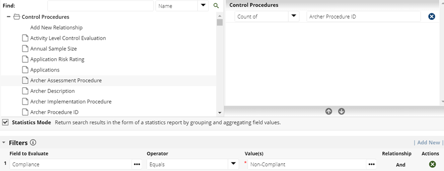
Once you have all the filters in place and you click on search, you will notice a new chart type called Featured Metric, automatically appears when you select the display mode as 'Chart Only' or 'Chart and Data'.
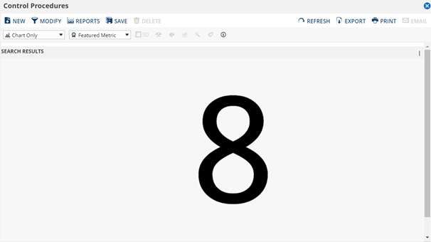
This search can be saved as a report and added to any report iView or a report object.
6 Column Dashboard Layout
Now that we have a new chart type and that we can add it to an iView and place it on a dashboard, the problem we have is that the current iViews are too big to accommodate these new charts. So we created a new layout option for dashboards - the 6 col dashboard layout option with (almost) equal sized columns. With this you can create an appropriately sized iView that holds the Featured Metric. This option can be enabled from the administration menu (Manage Dashboards) or from the options (Edit Dashboard) on the dashboard header.
Dashboard improvements
There are a number of improvements that have been made to the dashboards, some of the more important ones are highlighted below:
- The Dashboard toolbar is always displayed. This helps users by always showing them the dashboard they are on and also letting them access options such as printing of a dashboard, without having to scroll up.
- When a user hovers over an iView, the iView frame is highlighted and scroll bars are activated for the iView.
- Aesthetic updates for a modern user interface. By removing a lot of clutter (shading options, background images etc) users will not be distracted and can better focus on the information on the dashboard.
- Aesthetic updates to Grids/Tables across RSA Archer. This includes change in the default (non-configurable) color of grids to grey.
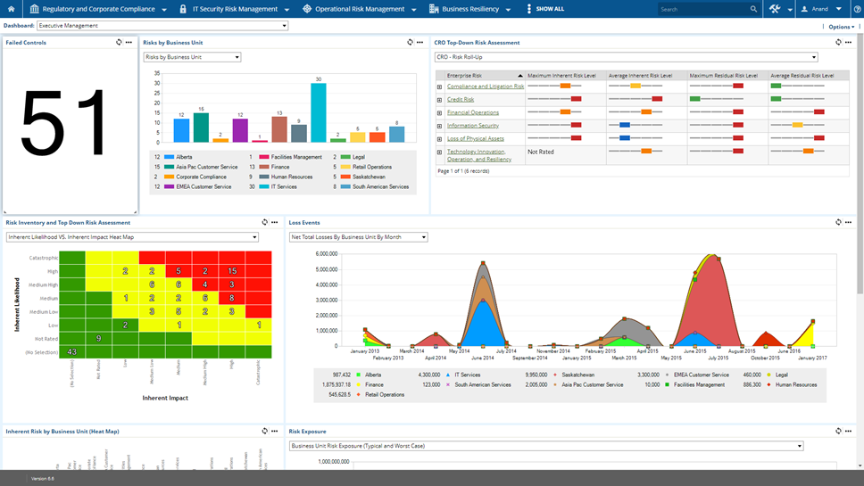
The cumulative effect of these improvements gives a vastly improved dashboard experience to the user. Here is an example of a dashboard in 6.6:
Heat Map and Scatter Chart improvements
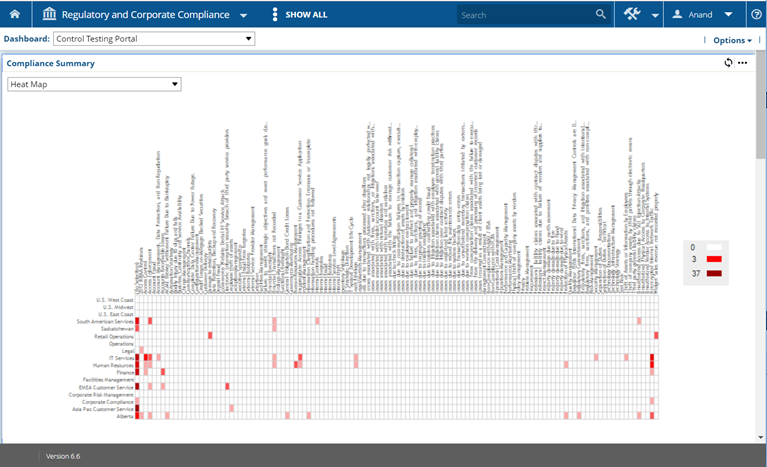
In the previous versions of RSA Archer, charts cannot be rendered when a statistical search returns more than 400 data points. While this holds good for most charts, there are certain use cases that need visual support for the data presented to the user. We have made improvements to heat map and a scatter chart to increase the limit of search results to support up to 9999 points. In case of heat map the limit applies only to a standard heat map and not for a risk map.
An example of a heat map with more than 400 data points:
All of these improvements will be covered in this week’s Free Friday Tech Huddle so please tune in to see these features in action!
