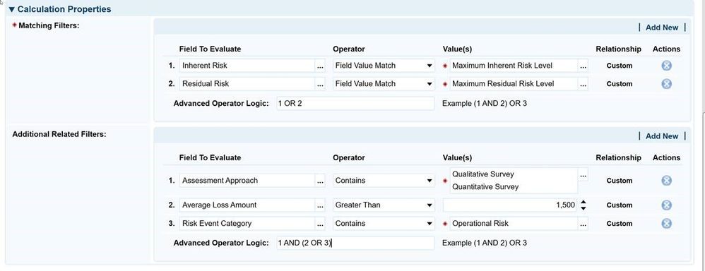
Over the past year, we have spent a great of time talking with many of you about your user’s needs. The culmination of these conversations has enabled us to begin our journey for usability experience improvements with RSA Archer release 6.5. One of the first concerns we hear regarding the user interface is there is a too much whitespace on the record page which provides the feeling that data is being displayed within a “sea of white”. We have additionally heard that the text color is too light to read within the “sea of white”. And on questionnaire pages, a few in our community indicated that they could not see where one question ended and another began. These concerns have one thing in common: readability. In short, your users are not able to consume the record page and questionnaires as they are hard to read. The RSA team has tackled these issues with release 6.5. First, the UX team tackled the light text labels. We have darkened and bolded the field label names. By default, when you install release 6.5, those field label names will be easier to see as there is a greater contrast between the dark text on the light background. If the System Admin chooses to revert to the lighter text, they can do so via a setting in the Administration menu. |
|---|
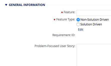 Prior to 6.5: Light gray field label names Prior to 6.5: Light gray field label names | | 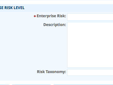
Darker/Bold Field Name Labels in 6.5 |
Next, we added better contrast between sections on the record page. To do so, we added a light shading to the sections. This shading provides a natural separation between sections making it much easier to tell where one section ends and another begins. The shading is based on the primary color chosen by your System Administrator within the Appearance settings. There are no configuration settings for this change – it simply works upon installation in release 6.5. 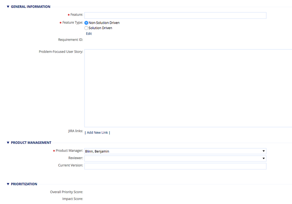
Section shading prior to release 6.5 | | 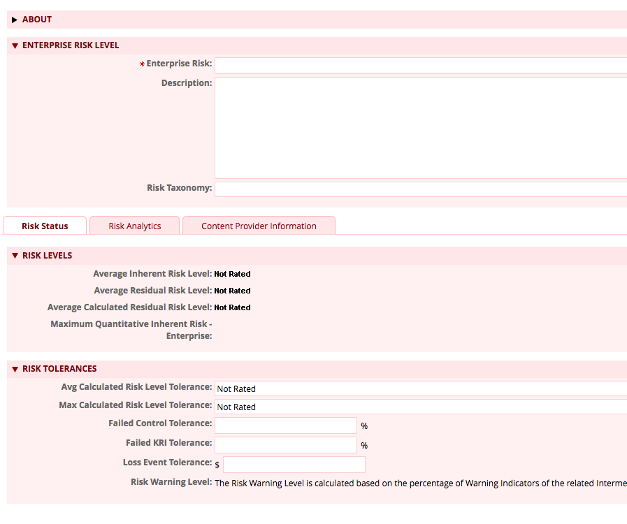
Section shading with release 6.5 |
The UX team also focused on the contrast between questions within a Questionnaire. Prior to release 6.5, the questions, controls, and comments icon were loosely placed on the page without a noticeable division between questions. The new shading behind sections allows each question to have a visual separation simply using white. 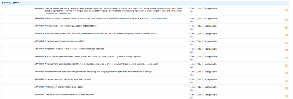
Questionnaire shading with release 6.5 Next, we focused on providing a better navigation experience. How many times have you used the top navigation, clicked the down arrow, and then tried to drag your mouse diagonally to get to the Solution and then the Application? Unfortunately, that workspace immediately closes and the one to the right opens – which likely results in a few choice words. Based on your feedback, we have addressed the issue in release 6.5. 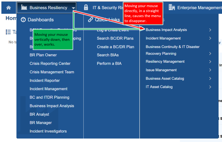
Top navigation improvements in release 6.5 Regarding accessibility, there was more 508/WCAG compliance progress made to for RSA Archer, including fixing some display issues while zooming at 75%, keyboard navigation within a dialog box, among others. Release 6.5 addressed some important user experience improvements on the record page and more. Accessibility enhancements continue to be a focus for each release. And there is much more to come! To learn more about the release 6.5 user experience enhancements, join the Free Friday Tech Huddle on November 30th at 11 a.m. Eastern. Remember, registration is required for this session. We hope to see you then! | 